Tuesday 13 July 2010

UK Postcode mapping in 5 minutes


I have read a number of posts lately detailing approaches for handling mapping postcode data in the UK, so I thought I would write another one.  I think this is the fastest way to achieve it.

To map postcodes in Tableau, you somehow need to get the postcode

converted to a latitude and longitude.  There are many ways to do this, but I think this has the least steps.

Follow these steps to map the OUTCODE (the left hand side of a post code) to a Lat/Long.  The assumption is that you already have a dataset which includes POST CODE

Minutes 1 and 2 – Add a csv file to your copy of Tableau desktop, this tells Tableau the Lat/Long of the outcodes

You’ll need a csv file of outcodes, so I have posted one here.  Copy this file and save it.

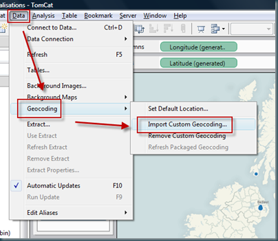
Add it to tableau LIKE THIS…  Choosing the csv file from your save location.

image


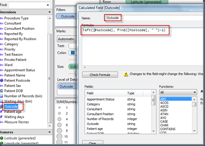
Minute 3 – Create a calculated field which grabs the outcode from the postcode.  The function for the calculated field is something like this:

left([Postcode], find([Postcode], " ")-1)

This finds the space in the postcode, and returns the left portion which is equivalent to the outcode in the csv file.

image


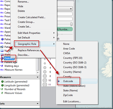
Minute 4 – Change the ‘geographic role’ of your calculated field to be outcode.  Outcode is now available as a geographic role because of the csv file added

image


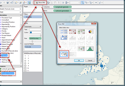
Minute 5 – Now you should be able to plot the outcode against a measure.  Select the outcode field, select ‘number of records’ (for example) and show me should now offer you a map.  Hey pesto, postcode mapping!


image

Happy mapping.

Tom

Simple forecasting using Tableau


So your boss asks you for a forecast – data driven of course, and he wants it in five minutes.  When’s that project going to finish, how many staff are we going to employ in a years time, what will be the final cost of the office move program.

AND I expect your boss wants a chart showing the EXACT date, headcount, cost, whatever.  AND he wants it in five minutes.

Don’t panic.  Crank out Tableau, and your done.

Lets forecast headcount based on the numbers for the last 24 months or so…  we’re looking for a prediction of the next 12 months, and we have 5 minutes to get it done…

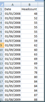
Here’s a sample of our data set:image

So, its simple enough to plot this out in Tableau, I’m simply going to cut and paste the data right in as its the fastest way…

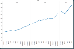
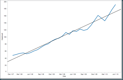
The first visualisation of this data is simply the headcount plotted against the date, thus:

image


Nothing very interesting here right, and hardly a forecast.

But with a few simply changes, we can get some decent information.

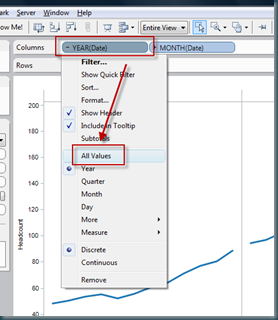
Firstly, using the drop down from the date field, select ALL VALUES.

image

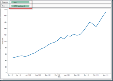
Remove all other dimensions from the column shelf:

image

And then add a trend line…

image

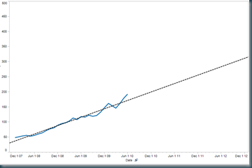
Now by changing the scale on the X axis, to extend the reach of the trend line, we can start to make simple data driven estimates of future headcount.  In my example, I had to edit the Y axis too, as the headcount was growing way past the current data set.  The result is as follows.

image

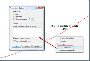
In order to reflect the increasing rate of change of headcount, I’ll edit the trend line as below.

image

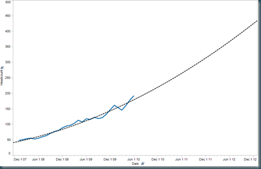
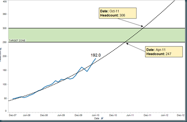
This gives us the following chart, which is pretty close to the finished article:


image

But with a little formatting, and using point markers, we can polish the chart to look like this:

image

This example uses banded reference lines, point markers (which get a dynamic value by dragging the arrow end), and a line end marker to show the current headcount value.

Enjoy.

Tom

Technorati Tags: ,