Thursday 17 December 2009

Tableau at hyper-speed – using Extracts to make your analysis fly


Tableau is so fast for development of data visualisations and ad-hoc analysis of data sets that any performance problems coming from your databases are immediately obvious and can take the edge of the promise of truly fast analysis.

No problem, Tableau thought of this too, and provided ‘Extracts’ to help solve this problem. 

Extracts are ONLY available for relational or flat data sources, not for multi-dimensional sources such as  Analysis Services.

Suppose you have a data set which is taking 10 seconds to respond – you will experience this 10 second delay every time you change a filter, move a dimension etc – anything you do will cause this 10 second wait (approximately!).

By taking an extract of your data, this delay almost always drops to almost zero, and you can fly through your analysis at light speed.  Refreshing the data is a one click operation.

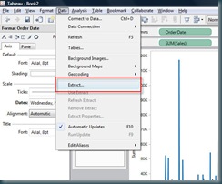
To create your first extract, simply use the data menu inside Tableau Desktop:

extract

You are able to specify attributes of the extract such as filters, percentage of data set to extract, and Top n rows etc.

You will have to specify a local file location for the extract file – which of course means you are now able to work OFFLINE!!
Thursday 3 December 2009

How to learn Tableau Desktop


Tableau is super easy to learn, but in the end, it doesn’t come for free.  You’ll have to put a little effort in, but Tableau have also done a great job of making the trip up the learning curve an enjoyable and easy one.

Here’s how to get from beginner to Jedi in a few days.

STEP 1:  Start by downloading the free trial, unless your boss has been kind enough to purchase the software for you.

Download from HERE.

STEP 2:  Watch the product tour.  This gives a great overview of the product in under 10 minutes and should leave you wanting to know more!  You can find the product tour HERE.

STEP 3:  Start using one of the data sources provided within the Tableau installation files – Coffee Store, or Superstore sales to produce visualisations.  These data sources are relatively rich and contain interesting data which allow you to evaluate the mapping features for example.

STEP 4:  Use the on-demand videos to continue your training – the top level index for these can be found HERE.  These appear to be long (3 hours +), but in reality they are broken up into a series of short clips which are very goal orientated.

Start with the introductory videos, and move into advanced and Jedi topics.

Treat the Advanced and Jedi topics as reference manuals – you do not need to remember everything in these sections, just knowing that these sections exist is enough – come back to them when the need arises.

STEP 5:  To achieve true Jedi status, you’ll need to work with many different visualisations and many different data sources.  Tableau have done a great job of making this possible by providing a suite of examples.  You can find them HERE.

These examples are ‘Packaged Workbooks’ which means both the data and the visualisations are included in the file.  If you download these workbooks and open them into Tableau Desktop, you’ll be able to see how they were built.

I recommend trying to recreate each page (without using ‘Duplicate Sheet’!!) – if you can recreate them all (there are nearly 100), you can truly call yourself a member of the Tableau Jedi.

Cheers

Tom

Wednesday 25 November 2009

What’s Tableau Reader?


Tableau reader is a free desktop application provided by Tableau.  It is required to read and interact with Tableau Packaged Workbooks.

You can download your copy of Tableau Reader here.

Tableau reader retains the ability to interact with visualisations created in Tableau desktop, but will not allow connections to data which can be refreshed.  Hence it is useful for reporting data when a snapshot of the data can be created – such as end of month reporting to your clients for example.

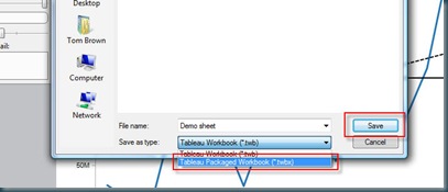
To create packaged files which can be distributed to users of Tableau Reader, you simply use ‘Save As’ from Tableau Desktop – and select ‘Packaged Workbook’:

reader

It is only possible save files as packaged workbooks if the data source chosen is suitable.  This means one of the following:

  • Excel
  • CSV
  • Tableau data extract

You cannot use multi dimensional sources (analysis services for example). 

I’ll post another time on using extracts – but that’s the way to make packaged workbooks when you are using data sources such as SQL server.

Good luck

Tom

Monday 23 November 2009

Did you know you can copy and paste data into Tableau?


A new feature in Tableau 5.0 desktop allows you to cut and paste data direct into Tableau for the fastest possible analysis.

Simply find some data, from a spreadsheet, or table in a web page – and copy the data.

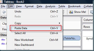
Tableau then offers a paste feature on the EDIT menu:

paste

You’ll probably want to clear the sheet immediately after pasting as Tableau typically predicts the visualisation you’d like, and unusually for Tableau – it tends to get it wrong.

Clear the sheet using the toolbar button:

clear

Happy pasting

Tom

Where is my data? How to quickly determine where the important data lives in a SQL server database.


Every time I start analysing a database, I want to know which are the key tables.  Typically this means knowing which tables have the most records in them – this is simple to find out, and if you then visualise the data, its possible to immediately see how the data is clustered throughout your database.

How to???  You should be able to do this in 2 minutes…

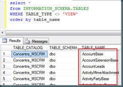
Start by running this query against your database – in SQL server:

select * from INFORMATION_SCHEMA.TABLES

WHERE TABLE_TYPE <> 'VIEW'

order by table_name

This gives the following result from Microsoft’s Dynamics CRM database:

query

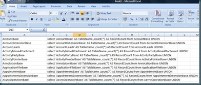
Now copy the contents of the table name column, and paste into the first column of an Excel spreadsheet.

Then add the following function to column B of the same spreadsheet, and fill the cells next to the table names by dragging the function down the Excel column.

=CONCATENATE("select '",A1,"' AS TableName ,count(*) AS RecordCount from ", A1, " UNION")

Your EXCEL sheet should now look something like this:

excel

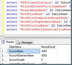
Now copy the contents of column B back to SQL management studio – removing the UNION keyword from the last statement and hit F5.

This should provide a list of tables with their record counts, like this:

result

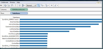
You might choose to stop here, but I like to cut and paste the data into Tableau, and then use a horizontal ranked bar chart to really see where the data is – you should end up with something like this:

tableau

Enjoy

Tom.

Sunday 22 November 2009

Using UK postcode data in Tableau


The Tableau data visualisation product produces geographic data visualisations in seconds if you are looking at data which includes references to US locations such as states, cities or zip codes.  but this is not the case for the rest of the world.  I guess to do so would have involved a lot of localisation for Tableau and probably added 100GB to the download size of the Tableau product.

I’m regularly asked how to plot data on Tableau map based visualisations using UK postcode data (or other geographical data for that matter).  Its a simple solution, and one that works the world over. 

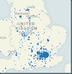
You simply have to translate your geographic data into Latitude and Longitude information, and then Tableau will happily plot the information on a map of the UK. 

I have created two files to explain this – firstly an EXCEL spreadsheet which contains sample sales data – this includes postcode data, and a VLOOKUP is used to link the postcode and the lat/long on the second sheet.  Note that the match is made only on the first part of the postcode (the outcode) thus giving a lower level of resolution than you would get from a full postcode match.  This is done as there are 17 million postcodes, and EXCEL would struggle.

GET EXCEL FILE

I have also create a Tableau workbook which shows this in action.

GET TABLEAU WORKBOOK

If you get this right, you’ll end up with something like this:

postcode

Best of luck.

Tom

Monday 13 July 2009

A wordle about Concentra

We regularly try to explain our business to people, it seems pretty obvious to me, but maybe that is because I ahve worked at Concentra for over four years.

But since I have found wordles, it seemed obvious to let wordle.net try to explain what we do.

This is a visualisation of the entire contents of our website, and as usual wordle has done a beautiful job of rendering the text from our website in a way that shows exactly what we do every day!


Sunday 12 July 2009

A way with Wordles

We're always looking for the next best way to visualise data, we've read all the books, been on Stephen Few's courses and used all the software out there, but I have to give credit to Jonathon Feinberg for the creation of wordle.net which create beautiful and informative word clouds from text.

We have been using the tool to visualise data, simply but providing a dataset which repeats the category names based on a given measure, it is possible to create great visualisations of say 'Top 20 clients', or 'Best performing sales person'.

Of course these are currently one off visualisations, but I doubt it will be long before a forward thinking data visualisation software tool such as Tableau incorporates this functionality into their toolset.

To demonstrate this tool, here's an image of the top 100 MP expense claimers, of course the size of their name shows how much they claimed: